Why modern architecture is making us sick

Uh, I can't agree with the example. This so called "scientific approach" was guided by nothing of the sort and was little different from the profit seeking approach. Only instead of profit there were figures in the statistics of the number of built square meters and the height was limited not by usefulness, but by the limitations of construction equipment of the times of Khrushchev and as soon as the development of technology and more production of elevators made possible the construction of 17-storey anthills in the times of Brezhnev. I would still understand if the example was given of Stalinist architecture, which was aesthetic and oriented towards low-rise buildings even with minimal decoration, but not the ugliness that followed it....
View attachment 78709View attachment 78710
Yep, Stalin’s time architecture was monumental and of very good quality standards (still quite a lot rich people prefer them to the modern house complexes) and low height.
Khrushev’s 5 floor houses (of course of poorer quality, rather low ceiling etc) - built fast and easy like a lego - but managed to solve the main problem- provide families (for free - i would like to add) with their own flats. That was an achievement as long as majority of people especially after the war had to live in communal flats (several families sharing one kitchen, wc)...
On the second picture - a standart new then sleeping district. That type started prevailing in the end of 70s-80s.
 
With logo design, the most important places logos need to work these days are screens, where a more 2D/flat design works best for readability and recognizability.

I disagree with that. I think that 2D/flat design with plain or no colors does exactly the opposite, it destroys both the readability and recognizability.

I see that somebody complained about this design approach on MS website:

For me and the mayority of people i know, the user interface is completity UGLY. With Windows 10 is more UGLY too changing the desktop icons.

Simple, plain, flat, lack of constrast between areas, terrible and heavy colors, bad icons seens to developed by a three years old baby.

Since 1990, all monitor are in color, and since 2000 the vast mayority of video cards support True Color (32 Bits) and i dont like and never use an OS that looks likes Windows 1.0 or 2.0. I want colors, degraded colors, transparencies, rounded borders, full color 3D icons, shadows, effects, and more. I want to see diferents color in diferents areas of a Windows like in Windows XP or all versions of Office except 2013.


And like I said, it's not just about computers, it's everywhere. And I see no problem that this approach solved. In fact, I don't see that there was any problem to be solved in the first place. Somebody just decided to simplify everything. Because of what? Because 3D logos and complex color design are too hard for their brains? Who has a problem with 3D and colors? Well, animals have that problem. So, are they creating a world for humanoid animals?
 
Yep, Stalin’s time architecture was monumental and of very good quality standards (still quite a lot rich people prefer them to the modern house complexes) and low height.
Khrushev’s 5 floor houses (of course of poorer quality, rather low ceiling etc) - built fast and easy like a lego - but managed to solve the main problem- provide families (for free - i would like to add) with their own flats. That was an achievement as long as majority of people especially after the war had to live in communal flats (several families sharing one kitchen, wc)...
On the second picture - a standart new then sleeping district. That type started prevailing in the end of 70s-80s.
No, it's not an achievement. It can be an achievement only from the position of gross materialism, which does not quite fit the topic of this thread about the influence of aritecture on the human psyche, i.e. that there is a more subtle aspect of this issue. I know very well about communal flats and barracks and the fact that even in normal housing like Stalinist flats lived several families per flat, a family per room, but qualitatively the presence of intimacy is the only advantage of Khrushchevs over all of the above. These are tiny slave barracks, not housing, and the difference between them and barracks is like the difference between a slave who sleeps on the floor and a slave who sleeps on a mat. I guess the USSR was a tiny country? No, then why did they decide to build millions of these micro-apartments in it, which are so high-mindedly called "an achievement", why do capitalist countries that also suffered from the war not having this achievement have more square metres per person? Why in such a "giant" country as Japan, which as we often say is overpopulated, the number of square metres per person is more than in the "tiny" country of Russia? (and if anything I am not a capitalist and I am not saying that modern anthills are better than old ones, I quite recognise the planned model of economy as viable and understand the key points when the planning system was corrupted by "Trotskyists", which led to the era of stagnation). And this is in a thread that considered the architecture of the west deviant but on their background our architecture is even more crippling to the psyche and soul so if and call it an achievement, then only an achievement in greyness and depression.
 
No, it's not an achievement. It can be an achievement only from the position of gross materialism, which does not quite fit the topic of this thread about the influence of aritecture on the human psyche, i.e. that there is a more subtle aspect of this issue. I know very well about communal flats and barracks and the fact that even in normal housing like Stalinist flats lived several families per flat, a family per room, but qualitatively the presence of intimacy is the only advantage of Khrushchevs over all of the above. These are tiny slave barracks, not housing, and the difference between them and barracks is like the difference between a slave who sleeps on the floor and a slave who sleeps on a mat. I guess the USSR was a tiny country? No, then why did they decide to build millions of these micro-apartments in it, which are so high-mindedly called "an achievement", why do capitalist countries that also suffered from the war not having this achievement have more square metres per person? Why in such a "giant" country as Japan, which as we often say is overpopulated, the number of square metres per person is more than in the "tiny" country of Russia? (and if anything I am not a capitalist and I am not saying that modern anthills are better than old ones, I quite recognise the planned model of economy as viable and understand the key points when the planning system was corrupted by "Trotskyists", which led to the era of stagnation). And this is in a thread that considered the architecture of the west deviant but on their background our architecture is even more crippling to the psyche and soul so if and call it an achievement, then only an achievement in greyness and depression.
I also do not like late soviet era houses in sleeping then districts. But let me remind you-that in USSR then was no Consumerism. And it was free for everyone! I also do prefer townhouse/separate house format outside the megapolis, but -the terrible logistics will eat away 3-4hrs a day for the road both ways.

For you to compare then and now capitalist version of houses. (That is one of the major construction companies in Russia called PIK, which is ‘developing’ most of the formerly deindustrialised zones in Moscow. Does it look better? Ok, it is not so greynish. But to my perception they are not any better. I am not mentioning here density of the blocks, quantity of flats per floor (simply mega anthill) and any other former earlier mentioned standards, draconian prices a meter and so to say ‘quality’ (by the way i spoke with a person from architect sphere. On my question how come such surrealistic/unpleasant design and colorwise is taken for the basis, the answer was AI program just draws such a pattern).

C5581BA3-9D41-498A-AA33-2DA6D22BA85D.jpegDC6647E0-D253-4D8F-BBE6-C52283D56F37.jpeg6422A207-B5E8-466B-B90D-E007A0EF4D53.jpeg234BA526-168C-431E-86D0-E4786F97E336.jpegB0FF20D6-7712-450E-9044-6D629B9FEF73.jpeg
 
Last edited:
For individual homes, I have been following the aircrete dome movement for a while. Aircrete blocks can be made to build square buildings, but the curves in dome homes are really nice. Low cost methods for owner builders started with Domegaia. The blocks are light, can float on water and can be worked and carved with ordinary carpentary tools. They're made from a mixture of portland cement, water and a foaming agent like dishwashing liquid. They very economical to build.


This youtube channel shows some of the steps and processes used.

While the aircrete dome home in Flaxton on the Sunshine Coast is the first council approved dome home in Australia:


- small dome homes that are smaller than the size where council approval is required have been built in Canungra to teach the skills and to be used for air bnb's.


Some other pictures:

Screenshot 2023-07-27 150051.png

Screenshot 2023-07-27 151110.png

Kind of like a Flintsones house :lol:
 
I disagree with that. I think that 2D/flat design with plain or no colors does exactly the opposite, it destroys both the readability and recognizability.

This is true in many cases IMO, but my point was rather that the big changes in how and where logos are used obviously had to have an impact on logo design. For example, a complex and fine-grained logo with a small font beneath it might work on a letter head, but not on a smartphone. Or the screen resolution is not enough for certain designs, or it's too small, or designers can explore more colors that couldn't be printed well but work on the screen etc. No question that design these days often sucks, and there are many stupid trends. But a certain amount of change was necessary, as it always is when things develop, and this *could* have been a great opportunity for creatively doing great things in a new environment.
 
For individual homes, I have been following the aircrete dome movement for a while. Aircrete blocks can be made to build square buildings, but the curves in dome homes are really nice. Low cost methods for owner builders started with Domegaia. The blocks are light, can float on water and can be worked and carved with ordinary carpentary tools. They're made from a mixture of portland cement, water and a foaming agent like dishwashing liquid. They very economical to build.


This youtube channel shows some of the steps and processes used.

While the aircrete dome home in Flaxton on the Sunshine Coast is the first council approved dome home in Australia:


- small dome homes that are smaller than the size where council approval is required have been built in Canungra to teach the skills and to be used for air bnb's.


Some other pictures:

View attachment 78789

View attachment 78790

Kind of like a Flintsones house :lol:
I love these homes...to me, a circular house is perfect, fluid and emotionally stable. I understand the confines of land and block, square designs mean more houses per square foot, but I've never been impressed...same with toilets in the house, I think it's quite wrong!
 
This is true in many cases IMO, but my point was rather that the big changes in how and where logos are used obviously had to have an impact on logo design. For example, a complex and fine-grained logo with a small font beneath it might work on a letter head, but not on a smartphone. Or the screen resolution is not enough for certain designs, or it's too small, or designers can explore more colors that couldn't be printed well but work on the screen etc.

I understand what you are saying, but my point is that the changes are going in the opposite direction where the technology is going, and where it has been going for many years. Screens on smartphones are getting bigger and the resolution is also increasing with every new model, so even from a technological standpoint, there was no need for such simplistic design. In fact, quite the opposite should be expected as the screens are improving, like it happened in the previous decades.

However, there is something that came to my mind while I was thinking about it. Who needs a more 2D/flat design for better readability and recognizability? Well, not the human beings, in my opinion. Then who? My answer is computers.

What do computers read in a real world? They read barcodes and QR codes, right? And how do they look like? Well, they have exactly the same design principles like these new logos. They have simplistic 2D/flat design. Why? Because, unlike human beings, computers have a problem with reading complex shapes.

Or perhaps these logos are designed by AI and the AI happens to prefer such design.
 
I understand what you are saying, but my point is that the changes are going in the opposite direction where the technology is going, and where it has been going for many years. Screens on smartphones are getting bigger and the resolution is also increasing with every new model, so even from a technological standpoint, there was no need for such simplistic design. In fact, quite the opposite should be expected as the screens are improving, like it happened in the previous decades.

Well, designers always lag a bit behind technology. By the time they realized that letter heads are not the main focus anymore, technology began advancing again. Second, look at the cass forum logo on a smartphone. Barely readable. (Do NOT change it please!) Again, I'm not defending these trends, but I can see how they have a certain utilitarian logic. In fact, this rampant utilitarianism is part of the problem: I prefer beauty over uniformity, predictability and "barrier-free" design nonsense.

However, there is something that came to my mind while I was thinking about it. Who needs a more 2D/flat design for better readability and recognizability? Well, not the human beings, in my opinion. Then who? My answer is computers.

What do computers read in a real world? They read barcodes and QR codes, right? And how do they look like? Well, they have exactly the same design principles like these new logos. They have simplistic 2D/flat design. Why? Because, unlike human beings, computers have a problem with reading complex shapes.

I think this is a bit of a stretch. The problem is the degradation of the human spirit: the worship of progressivism and change, the idea that everything "old" is bad, laziness that leads to designers just adopting the latest fashions, robotic corporate culture, globalization of tastes that eradicates cultural oddities and differences, corporations who play it safe, ugly minimalism that has been elevated to global hipsterdom for many decades now in all areas of creativity (architecture, music etc.) and so on. We humans have turned ourselves into bland automatons.
 
I think this is a bit of a stretch. The problem is the degradation of the human spirit: the worship of progressivism and change, the idea that everything "old" is bad, laziness that leads to designers just adopting the latest fashions, robotic corporate culture, globalization of tastes that eradicates cultural oddities and differences, corporations who play it safe, ugly minimalism that has been elevated to global hipsterdom for many decades now in all areas of creativity (architecture, music etc.) and so on. We humans have turned ourselves into bland automatons.
Progressivism does a lot of talk about "change", but everything that happens only eliminates change, except that which is the most unconsequential, the most surface level. They say they want everyone to express themselves, but panic when someone does not express the same robotic mindset. They claim to worship the individual, but do everything in their power to eliminate the individual and force everyone into one collective.

They say they want diversity, but if you don't share their worldview, you are not welcome.
They say they are for minorities, but "if you don't vote Joe Biden, you ain't black".
They say one thing, but expect you to do the exact opposite, and gaslight you if you do something you're not supposed to.

It's all a game of pretend. It's all just make-believe and feel-good. It's all about doing whatever and having a narrative that makes one feel good about it. It's a spirit-degrading world for those that do not have a spirit that can degrade. A world by psychopaths, for psychopaths. A world that is a reflection of them: say and pretend to be one thing, while actions and fruits of labor tell the exact opposite. This mentality seeps into everything, including architecture.

And yet, people are clearly not happy living like this. TV is losing its viewers, people are less and less willing to vote for a failed system, they are completely tuning out of society and not interacting with it at all whenever possible. People still want to live in a small house in the country. People still want to run away from the corporate monstrosity. They want to shout, they want to scream, but knowing that they will be not be heard and will be ignored, they focus on the only things in life they have power over, fill their own niches, and "vanish" from wider society.

We have not turned into bland automatons. Bland automatons remained bland automatons.
The difference is that now, the bland automatons are left alone to do whatever they want, because last ounces of creativity, last traces of soul, are finally withdrawn from the system, and all that is left is a soulless mush that cannot create, only consume. Architecture, entertainment, art, there is nobody with a soul there anymore, they were all driven out, or quit on their own.

And since there is nobody left that can keep the facade, now everyone can see the face of the beast.
 
Second, look at the cass forum logo on a smartphone. Barely readable.
You are right. They should change our corporate logo. :-D

We humans have turned ourselves into bland automatons.
I agree with everything you said except for this part. All of this just doesn't make any sense to me from a human perspective. I understand utilitarianism, but I think that this goes beyond that. It just looks to me like it was designed by some AI program, like Antony said about those buildings. Or some 4D STS mind. We do have human societies that do not like colors, for some reason:

 
It just looks to me like it was designed by some AI program, like Antony said about those buildings. Or some 4D STS mind.
These things are clearly designed by humans, but where do they get those ideas from? Or rather how did all those trends and developments somehow conspire over history to produce the worst of all worlds? A world that indeed might as well be designed by a stupid AI? It's an interesting question I have often wondered about as well...
 
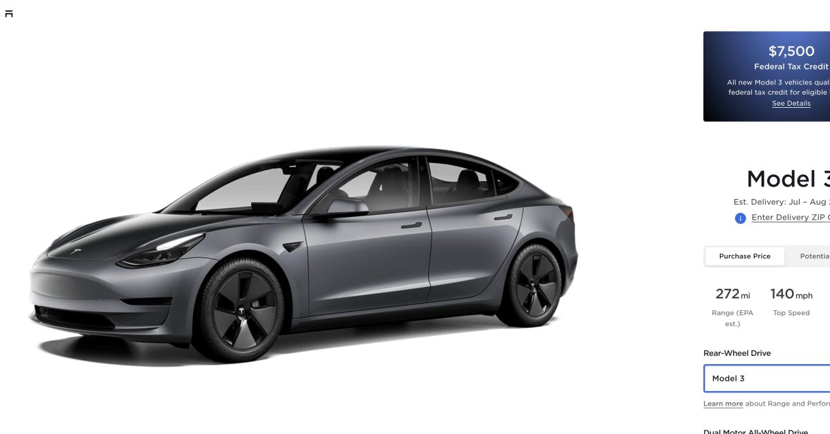
I just noticed that even the Elon Musk's cars are not very colorful.

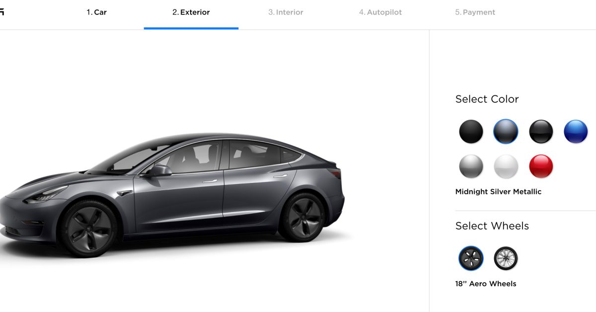
Tesla changes its standard color, now Midnight Silver

Tesla has changed its standard paint color for the Model 3 and Model Y. Now everything but Midnight Silver is at least $1,000.

“Any customer can have a car painted any color that he wants so long as it is black,” that’s what Henry Ford supposedly said when asked why Ford was not offering different colors for the Model T.

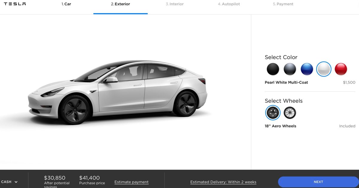
When first launching the Model 3, Tesla only made a black color option standard and everything cost a $1,000 or more premium – sort of following in Ford’s footstep.

Much like Ford’s obsession with efficiency, Tesla also limited the option to streamline production.

Later, Tesla also eliminated some other paint options to increase production efficiency.

With so few colors and only black being included, it resulted in many Tesla vehicles being black as the automaker ramped up production.

After a few years of black being the only standard Tesla paint color, Tesla changed it to white in 2019.

It has now been years of white Tesla vehicles, but Tesla finally changed it today.

Tesla updated its online configurator for Model 3 and Model Y to make Midnight Silver the standard color.

For Model S and Model X, Tesla appears to be keeping white as the standard color for now.

Electrek’s Take

Honestly, it will be refreshing to see more silver Tesla vehicles.

Four years of white Teslas, just as the automaker has ramped production to almost 500,000 units per quarter, has resulted in a sea of white Tesla vehicles. You can literally spot half a dozen in five minutes in some big cities.

Hopefully, Tesla doesn’t let silver be the standard for as long as white, and they start to alternate more often.

Top comment by Tom D:

How is it that Tesla is unable to do what pretty much every other auto company manages, which is to offer a choice of several colors without an upcharge? But midnight silver at least should be a slight improvement over the massive number of bland white vehicles that Tesla has put on the road in the past few years.


Of course, they gave a perfectly rational explanation for this lack of color:

Tesla to eliminate some paint options to increase production efficiency, gives last chance to order

Tesla is telling customers that it is about to eliminate some paint options for Model S, Model X and Model 3 “in order to increase production, delivery and service efficiency.”

The automaker is offering customers a last chance to order them.

CEO Elon Musk has recently talked about the Fremont factory’s paint shop, which supports the production of all of Tesla’s vehicles, being a bottleneck in Model 3 production.

In order to reduce complexity, Tesla limited the number of paint color options when launching the Model 3.

In June, the automaker ended up adding some paint options almost a year into production, but now they are walking them back to reduce the options again.

Tesla is sending out an email to reservation holders and potential buyers about the removal of “Metallic Silver” and “Obsidian Black ” as paint options from all their online vehicle configurators:

“In order to increase our production, delivery and service efficiency, we will be removing Metallic Silver and Obsidian Black Metallic as paint options from our online vehicle configurators for Model S, Model X and Model 3. This will be effective on Thursday, September 13, 2018, after which Metallic Silver and Obsidian Black Metallic will be offered only as limited edition colors via special request at a cost of $2,000 only until Friday, September 21, 2018.”

But the automaker is instating a phase-out period to leave buyers the opportunity to still order the colors.

They have until Thursday, September 13, 2018 to order them at current cost and then another week to get them as a “special request” for $2,000 instead of the current $1,500 price.


Americans criticized Koreans, but they are not a very colorful nation either. 73.86% of their cars are either black, white, gray or silver:

 
As for the reasons for eliminating windows, I think many such companies would overtly explain that by making the buildings more “green“ and “energy saving“ for “the environment and the workers“. But I think that “explanation“ is often just a cover and lip service for some of the real reasons.

I think the uglifying and removing of windows so as not to ‘distract’ people in the name of ‘productivity’ is very shortsighted. I would posit that the opposite is true - natural and beautiful environment is likely to increase productivity. It’s possibly a similar mechanism as productivity increases if you have regular breaks as opposed to work continuously. I know for a fact that many people stay at their desk and ‘simulate’ working to not disturb the ‘corporate ambiance’, but are they productive?

I remember in my student days I worked in a company that was involved in mailings. My job was to type addresses into a program that they had obtaines from God know where. In short, extremely dull and boring. But the ’corporate culture’ at this place was such that there was a drink ‘vending machine’ (but free), where you could get a can of soda and have a chat with some other office worker. And it was encouraged by my boss to take regular breaks and have a can. And I remember that I would take a 15 min break every 2 hours or so, which would revitalize me and probably made more than up for the lost work in these breaks.

So for me the question is - I am sure that fundamentally the hierarchy (whoever that is) is aware of this fact. So that means that it is not really about productivity, but something deeper - I don’t know what exactly, maybe control?
 
Back
Top Bottom